

How fashion moved from monochrome imagination to chromatic seduction

There was a time, 1911,(Victoria and Albert Museum) when fashion was not first experienced in color, but in shadow, contrast, light, and suggestion.
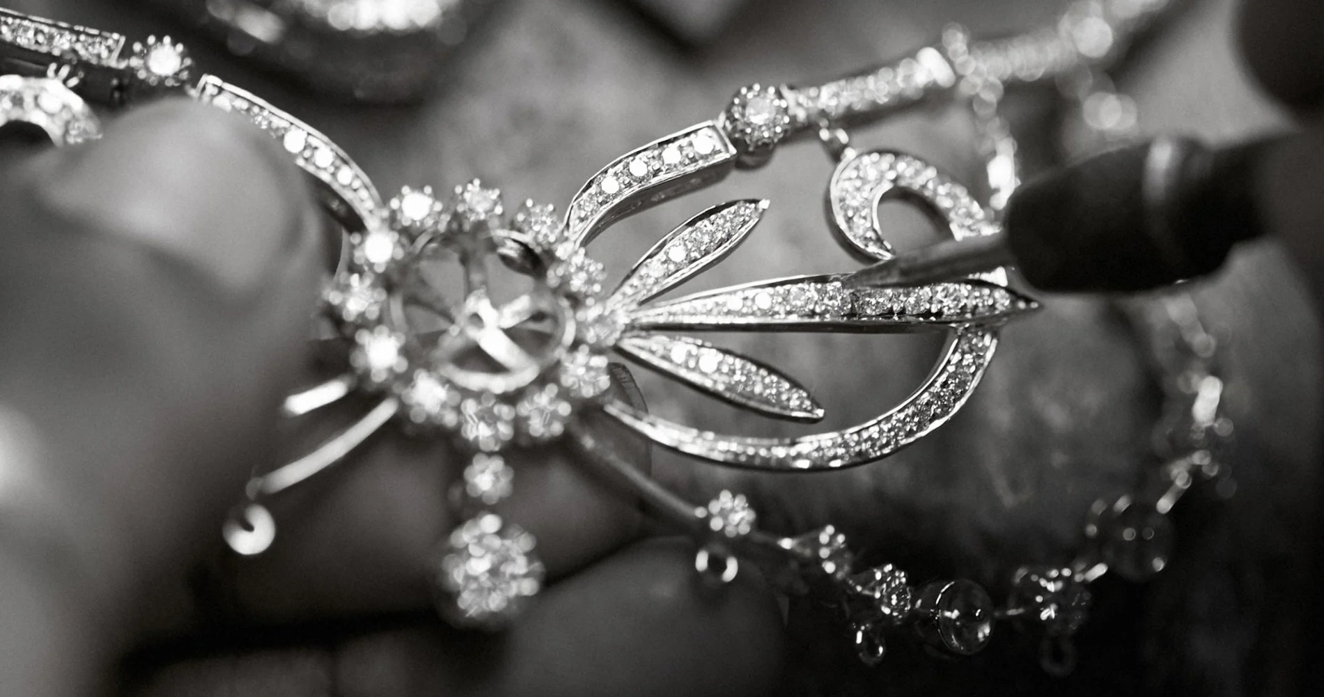
Before color photography became widely accessible in magazines and visual media, fashion lived for a long time through black-and-white imagery. It was seen in tonal gradations, in the architecture of garments, in the discipline of silhouette, and in the tension between brightness and darkness. In that visual world, the eye was trained differently. It did not immediately search for chromatic impact; it searched for line, volume, gesture, material, and mood.
Black-and-white fashion imagery did not diminish fashion. In many ways, it purified it.
Without color, clothing had to communicate through form. A jacket had to assert itself through cut. A dress had to move through shape. A textile had to suggest richness through texture rather than hue. The absence of color intensified other languages of fashion: the structure of couture, the balance of proportions, the drama of tailoring, the elegance of contrast. In editorial photography especially, black and white gave fashion a different kind of authority. It turned garments into compositions. It made the body sculptural. It gave the fashion image a seriousness that often resembled portraiture, cinema, and art.
And yet, when fashion finally entered the age of color in a fuller and more consistent way, something fundamental changed.
Color did not simply add information. It transformed desire.
To see fashion in color meant to encounter it more directly, more sensorially, and perhaps more seductively. What had once been imagined now appeared in full visual force. A red dress was no longer only a dark tone interpreted by the viewer’s imagination; it became an immediate emotional signal. A blue silk blouse could now communicate coldness, refinement, distance, or modernity through color itself. Green, yellow, orange, ivory, fuchsia, burgundy — all of them entered the image not merely as decorative details, but as active participants in meaning.

Color gave fashion a new power: the power to arrest attention instantly.
This shift mattered enormously in magazines. In black-and-white editorial culture, the fashion image invited contemplation. In color, it also invited impact. The page became more immediate, more visceral, more commercially effective. Color photography intensified aspiration because it brought garments closer to lived experience while simultaneously making them more cinematic. Readers were no longer only observing fashion; they were being drawn into its emotional atmosphere.
This was one of the great transformations of fashion communication. Color allowed fashion not only to be seen more fully, but to be staged more strategically.
From that point forward, color became one of fashion’s most deliberate tools of persuasion. It could attract the eye from across a page, distinguish a brand, define a season, create mood, or build identity. Entire collections could be remembered by a single dominant palette. Entire decades could be associated with particular chromatic sensibilities: the disciplined elegance of black, the optimism of bright pop colors, the neutrality of minimal beige and ivory, the aggressive glamour of saturated tones, the intellectual coolness of greys and muted palettes.
Fashion understood quickly that color was not innocent. It was psychological, commercial, and symbolic.
A bright color could create urgency. A soft color could create intimacy. Monochrome could signal sophistication. Contrasting tones could communicate rebellion, youth, or modern energy. Luxury houses learned to build recognition not only through silhouette and logo, but through chromatic memory. In this sense, color became part of branding long before branding became a modern obsession.
But more than that, color changed the public’s relationship to fashion because it made fashion easier to desire.
Black-and-white photography had required imagination. Color reduced that distance. It offered immediacy. The viewer no longer needed to mentally reconstruct the emotional force of a garment; the image delivered it directly. This is one reason why color became so central not only to editorials, but to advertising. Once fashion entered the age of visual abundance, color became one of its most efficient ways of producing attraction, fantasy, and consumption.
And yet, the legacy of black-and-white fashion never disappeared.
Even now, black-and-white editorials continue to return whenever fashion wants to reclaim a sense of timelessness, severity, intimacy, or artistic seriousness. Black and white still suggests that fashion can be more than seduction. It can be form, memory, discipline, and idea. It reminds us that before color amplified fashion’s emotional charge, fashion had already learned how to speak through shadow and structure.
Perhaps this is why the transition from black-and-white to color remains so fascinating. It was never simply a technical evolution in photography. It marked a broader shift in how fashion was perceived, consumed, and desired. It moved fashion from interpretation to immediacy, from tonal elegance to sensory persuasion, from distance to impact.

To see fashion in black and white was to understand its bones.
To see fashion in color was to feel its pulse.
And once fashion discovered how powerfully color could attract attention, create longing, and construct identity, there was no turning back
By Nicolò Di Stefano
Selected by the Editor
Where luxury is designed for Shiba Inus and their people.




Leave a Reply